
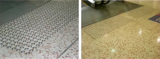
Architects, Designers and the like often fall into the trap of specifying the individual tactile dots. These individual tactile dots are called discrete tactiles. Discrete tactiles are required by AS1428.4.1 – 2009 to have a minimum allowable luminance contrast ratio of 45%.
This usually catches people out as most people know about the 30% contrast ratio but haven’t come across the 45% or the 60% (composite discrete tactiles) requirements.
For example, see pictures below of where these discrete tactiles do not have sufficient contrast ratios.
There are over 300,000 people in Australia who are blind and/or have impaired vision. This number is constantly increasing, as one person is diagnosed with irreversible vision impairment every 65 minutes. Unfortunately, most of these cases can not be corrected by wearing glasses or contact lenses. By 2021, it is estimated that the total number of blind or vision impaired people in Australia will increase to over 420,000.
According to Vision Australia, vision impairment is defined as “any person who has some degree of sight loss”. While many eye conditions and forms of impairment remain completely untreatable, some forms of vision impairment can be treated by wearing corrective lenses.
Building an environment that is designed to support the community of people with vision impairment is an important step for Australia. The Building Code of Australia and the National Construction Code call for a minimum required amount of luminance contrast levels in many buildings and building elements such as travel path or accessway. This includes installing ground surface indicators in an accessible pathways, installing staircase nosings in multi level buildings, adding Braille on all signage throughout the building, adding lift control buttons on all evacuation chairs and elevators, and installing accessible toilet seats. An important factor to remember is that the BCA only specifies the minimum required amount of luminance contrast levels and can easily omit other important finishes that are not detailed in the BCA.
According to Australian Standard, luminance contrast is defined as “the light reflected from one surface or component, compared to the light reflected from another surface or component”. This is not referring to the difference in colour, but rather the difference of the light reflective properties of each colour.
By having a vast selection of internal finishes with the appropriate levels of luminance contrast, those with vision impairment will be able to easily navigate through the environment of the building and surrounding areas. They will be able to easily identify doorways and read all the proper signage. They will also feel safer when travelling through more hazardous areas such as a staircase, ramps, and those areas that have a high chance of vehicle impact.
The luminance contrast of building elements is referring to the actual difference in the amount of light reflected from a darker building element in comparison to the amount of light reflected from a second lighter building element.
The minimum required levels for all doors, doorways, and circulation space in the doorways need to have a minimum of 30% luminance contrast between the following:
● door leaf and door jamb
● door leaf and adjacent door
● architrave and wall
● architrave and door leaf
● door jamb and adjacent wall
In regards to the above pairings, the minimum width of the luminance contrast must be at least 50mm wide.
All of the contrast lining on the glazed doors must contain a minimum of 30% luminance contrast from a viewing angle by the floor surface or any surface that is within a 2m radius of the actual glazing on the other side.
Each stair tread must contain a strip at the nosing of no less than 50mm and must not exceed 75mm deepness across the entire width of the travel path. This same strip must also be placed back a maximum distance of 15mm from the front of the nosing. This strip must also contain at least 30% luminance contrast from the background, where the luminous contrasting strip fixed to the surface of the tread.
Each toilet seat must contain the minimum luminance contrast levels of 30% against the background.
There are many different types of tactile ground surface indicators. The following are the most well known and most often used:
This series of tactile ground surface indicators are defined by using a pattern of the same colour and the same material as the surface that is underlying. These integrated tactile ground surface indicators that use the same colour must contain the minimum requirements of 30% luminance contrast across the entire area.
This series of tactile ground surface indicators are individually installed and are not apart of a group. The tactile ground surface indicators must contain the minimum requirements of 45% luminance contrast across the entire area.
This series of tactile ground surface indicators are constructed by using two separate colours or materials. There is a raised surface that should have a section that contains the minimum requirements of 60% luminance contrast, including a diameter of 24mm to 25mm.
Understanding Luminance ContrastColour is defined as
 “The sensation experienced or caused by light reflected from or transmitted through objects”. In the strict sense, we cannot directly measure perceived colour, however we can measure and subsequently calculate certain factors which are responsible for producing this sensation of colour.
Luminance Contrast Testing is carried out to determine the sensation experienced or cause by reflected light of a surface. It’s important to note the the type of finish and surface itself influences this sensation.
Perception of color begins with specialized retinal cells containing pigments with different spectral sensitivities, known as cone cells. In humans, there are three types of cones sensitive to three different spectra, resulting in trichromatic color vision. The cones are conventionally labeled according to the ordering of the wavelengths of the peaks of their spectral sensitivities: short (S), medium (M), and long (L) cone types.
These three types do not correspond well to particular colors as we know them. Rather, the perception of color is achieved by a complex process that starts with the differential output of these cells in the retina and it will be finalized in the visual cortex and associative areas of the brain. For example, while the L cones have been referred to simply as red receptors, microspectrophotometry has shown that their peak sensitivity is in the greenish-yellow region of the spectrum.
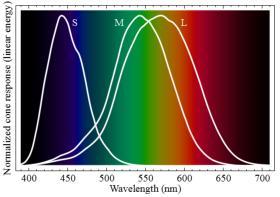 Similarly, the S- and M-cones do not directly correspond to blue and green, although they are often depicted as such. It is important to note that the RGB color model is merely a convenient means for representing color, and is not directly based on the types of cones in the human eye. The peak response of human cone cells varies, even among individuals with ‘normal’ color vision;
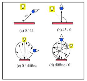
Nothing is capable of measuring colour / luminance contrast as well as what the natural eye is capable of doing. The Australian Standards that specify the equipment to use to test luminance contrast is AS1428.1 – 2009 & AS1428.4.1 – 2009. These standards state that the instrument to be used in a laboratory test is:
“A tristimulus colorimeter, or spectrophotometer with a diffuse illumination/normal viewing (d/o) geometry, is used with CIE Standard Illuminant D65. The instrument has to be capable of measuring absolute CIE for Yxy to be calculated. The measured luminous reflectance is defined by the tristimulus value Y. The chromaticity coordinates x and y provide an indication of the colour.” and for On-site “A single lens reflex luminance meter commonly known as a photometer with a 1° measurement field and a spectral responsivity approximating the CIE 1931 Standard Observer V (λ) function as specified in ISO 11664-1 are to be used.”
It is important to note the geometry required for tristimulus colorimeters and spectrophotometers – (d/0). What this means is that the light source is diffused through a spherical dome and the receptor (measuring point) is at 0degrees. This is best shown in the below picture.
 Whenever testing is conducted to establish contrast ratios for the purposes of compliance under AS1428.1 & AS1428.4.1 it is essential that the testing company has the correct geometric equipment. Should a case ever be brought into a court of law the scrutiny would be straight on the testing equipments compliance to the standards. If wrong equipment is used then wrong results will be given which increases the chances of possible litigation
What is not mentioned in these standards and is of great significance in terms of luminance contrast is Specular Inclusive and Exclusive measurements. Specular Inclusive measurements are “Colour” and Specular Exclusive measurements are “Appearance”. Meaning that in terms of luminance contrast of colours the best testing to determine contrast is Specular Inclusive. All of the Dulux LRV’s contained in the rear of the fan deck are Specular Inclusive measurements. If appearance measurements are required then the Photometer tests can be performed (Note that these are effected by ambient light). Luminos Consulting laboratory test are Specular Inclusive.
Signs, Signage & Wayfinding
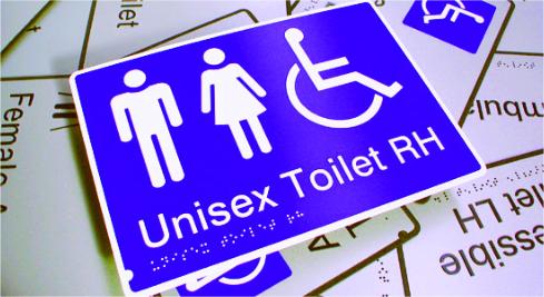 The primary aim for signs is to be SEEN!!! – Of what use is a sign that blends into its background or has text the same colour as the background? It’s useless!!! Signage benefits all people from all areas of life and assists us navigating through busy, difficult and unfamiliar environments. It is essential that all signage stands out and is easily understood.
Just take time square in New York as an example – signage experts competing for their signs to stand out. This is also the case with signage for information purposes and identification of certian building elements that relate to disability access requirements.
The Access to Premises Standards states:
The following apply to luminance contrast: (a) the background, negative space, fill of a sign or border with a minimum width of 5 mm must have a luminance contrast with the surface on which it is mounted of not less than 30%;
(b) tactile characters, icons and symbols must have a minimum luminance contrast of 30% to the surface on which the characters are mounted;
(c) luminance contrasts must be met under the lighting conditions in which the sign is to be located.
This therefore means that signage too must meet the minimum 30% luminance contrast ratios and in most cases will require a test to confirm compliance.
Luminance Contrast Equipment & EquationsThe endless complexities of the Standards continue.
I thought I’d post this after having discussions with numerous people regarding equipment and equations. Most people are getting this wrong. Please note that the Standard defines two (2) ways to calculate luminance contrast (Building elements – TGSI’s use the same equation) – most people are just using the Bowman-Sapolinski equation for building elements other than TGSI’s. This equation is ONLY usable for luminous reflectance values and should not be used with luminance values. Luminance values need to use the equation in B5.3 (e) of 1428.1 – 2009. Note that if TGSI’s are being tested then the Bowman-Sapolinski equation is used – another interesting contradiction between these two standards.
An now a little about equipment – if you’re looking at buying some equipment to test contrasts – do yourself a favour and buy a Photometer. In most cases, you will be testing in an on-site setting and this will be fine – note that if your testing TGSI’s then there is a set up that needs to be done. The biggest issue is the laboratory tests.
You cannot use the colorluminator, NCS or similar or any spectrophotometer. The reason for this is geometry. The Standards state for laboratory tests the instrument must be
“A tristimulus colourimeter or spectrophotometer with a diffuse illumination/normal viewing (d/o) geometry is used with CIE Standard Illuminant D65. The instrument has to be capable of measuring absolute CIE for Yxy to be calculated. The measured luminous reflectance is defined by the tristimulus value Y. The chromaticity coordinates x and y provide an indication of the colour.”
The important thing to note is the (d/0) – this means a diffuse illumination (spherical dome illumination) with the receptor (measuring point) at 0degrees.
Most of the equipment that people are using (Tristimulus Colorimeters – including the colorluminator) has a geometry of 45/0. This geometry does not meet the Standards and illuminates from 45degrees and measures from 0degrees. Even more so – there is NO spectrophotometer that has (d/0) – what IS available is diffuse illumination 6-8degree. It is also EXTREMELY important to understand specular component included or excluded. I.E. glossy surfaces will measure differently. Another big question is – Who’s going to tell the CSIRO that their Gardner Gmbh colour Guide doesn’t meet the Standards??? It’s a spectrophotometer with 45/0.
Does the ME64 committee or Standards Australia actually understand what they are including in the standards and the liability & risks these irregularities will cause for specifiers, certifiers etc should an issue in the future go to court?
One more quick equation issue for you to think about. If you have a Dulux LRV value of 50 what is the required LRV’s to achieve the 30% – most people answer by saying 30% difference from the 50. If you review the table B1 you’ll notice that the lighter possible surface is actually 80% difference and the darker 50% difference. We must be careful with these equations.
I’ve spent considerable time working through these issues and welcome any discussions – if you would like further explanation or info please feel free to give me a call or drop me an email.
Doorways & Interior DesignWith the release of the Australian Standard AS 1428.1 – 2009 came a clause that has, will have and continue to create issues for designers, architects and building certifiers. The AS 1428.1 – 2009 Clause 13.1 Luminance Contrast states:
“All doorways shall have a minimum luminance contrast of 30% provided between—
(a) door leaf and door jamb;
(b) door leaf and adjacent wall;
(c) architrave and wall;
(d) door leaf and architrave; or
(e) door jamb and adjacent wall.
The minimum width of the area of luminance contrast shall be 50 mm.
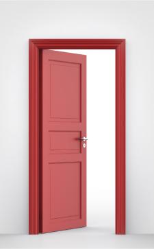 This clause is applicable to ALL new buildings and ALL doorways the are from a “New Part” of a building to the principal entry. This requirement becomes relatively difficult to meet with building materials such as anodized aluminium framing and glazing.
When considering the use of anodized aluminium framing and glazing, one must realise that the adjacent surface is the floor/wall that is seen through the glazing. It is, therefore, a test that can only be done accurately with a Photometer that measures the surface through the glazing. Luminos are able to conduct these tests as well as provide accurate analysis of the probability of the luminance contrast with the use of laboratory testing.
It is also important to note that visual indicators on glazing;
“Where there is no chair rail, handrail or transom, all frameless or fully glazed doors, sidelights, including any glazing capable of being mistaken for a doorway or opening, shall be clearly marked for their full width with a solid and non-transparent contrasting line. The contrasting line shall be not less than 75 mm wide and shall extend across the full width of the glazing panel. The lower edge of the contrasting line shall be located between 900 mm and 1000 mm above the plane of the finished floor level.
Any contrasting line on the glazing shall provide a minimum of 30% luminance contrast when viewed against the floor surface or surfaces within 2 m of the glazing on the opposite side.
Although there is no actual clause that mandates interior design to achieve 30% contrasts – it’s always a perfect way to highlight and identify key elements. 30% is the recognised luminance contrast ratio for building elements so achieving this as a minimum will ensure these are sufficiently highlighted.
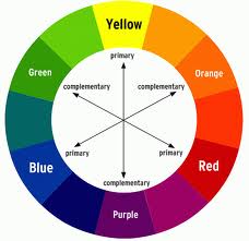
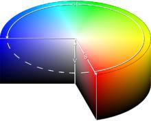
Contrasting ColoursIn colour theory, two colours are called complementary if, when mixed in the proper proportion, they produce a neutral colour (grey, white, or black). In roughly-perceptual colour models, the neutral colours (white, greys, and black) lie along a central axis. For example, in the HSV colour space, complementary colours (as defined in HSV) lie opposite each other on any horizontal cross-section.
Thus, in the CIE 1931 colour space, a colour of a particular “dominant” wavelength can be mixed with a particular amount of the “complementary” wavelength to produce a neutral colour (grey or white). In the RGB colour model (and derived models such as HSV), primary colours and secondary colours are paired in this way: red and cyan; green and magenta; blue and yellow.
One of the simplest way of ensuring that colours contrast is to use a colour wheel. The complimentary or contrasting colour is the one that is directly opposite the one chosen. This is however not always complimentary to the design or effect that is trying to be achieved.
 Where the minimum contrast of 30% is required it is advised to have tests conducted or to utilize the contrast calculators the Luminos Consulting provide. This does require the LRV’s or cd/m2 to calculate the luminance contrast ratios.
The requirements in the built environment for contrasting colours has greatly increased in the past few years. One of the best ways to know whether two colours are sufficient in contrast is the age-old test – “Can you see two colours and does it look right?”
Unjustifiable Hardship
The Disability (Access to Premises Standards – Buildings) 2010 (Premises Standards) and the 2011 version of the Building Code of Australia (BCA) came into force on 1st May 2011 and applies to all new buildings, and new works associated with existing buildings. It includes specific access provisions and references a number of Australian Standards that relate to disability access.
Typically, these access standards are updated versions of the previous access standards, which now have enhanced/additional access provisions. The Premises Standards and the BCA do not have any retrospective triggers to upgrade existing buildings that do not comply with the current access standards. However, if an existing building remains unaltered, it will always be subject to a complaint under the Disability Discrimination Act 1992 (DDA). If upgrade works are undertaken to an existing building that requires building approval, then the Premises Standards requires the ‘new part’ to comply with the relevant access provisions, as well as requiring the ‘affected part’ to be accessible and meet the current access standards.
The ‘affected part’ is defined as the path from the ‘new part’ to the main entrance of the building.  This concept can have significant implications for an existing building. For example, if the upper floor of an existing building is refurbished via a building approval process, a new lift may be required to form part of the accessible path to the ground floor main entrance. There are a number of concessions and exemptions under the Premises Standards for existing buildings, which relate to works undertaken by a lessee in a multi-tenanted building, the re-use of existing lifts (certain dimensions apply) and the re-use of an existing accessible toilet that complies with the previous access standards. In some cases, compliance with the current access standards may be difficult and costly.
Buildings are becoming more and more fire engineered. This means that a Fire Engineer has been involved in developing an approved and compliant building design that meets the ‘Performance Requirements’ of the Building Code of Australia (BCA).
 When a Fire Engineer writes a Fire Engineering Report and proposes the adoption of an ‘Alternative Solution’ as a form of compliance with the BCA, there must be consideration for the needs of people with disability in the evacuation plans and procedures for the building.
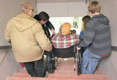
The current BCA has very few ‘Deemed-to-Satisfy’ access provisions pertaining to the evacuation of people with disability. At the moment the BCA limits these provisions (introduced into BCA 2013) to providing the following from accessible parts of the building:
As of the 1st of May 2014, the Building Code of Australia (BCA) provides changes that will affect building designers, certifiers and access consultants.
The change that directly affects access for people with disabilities involves the introduction of specific slip-resistance classifications for ramps, stairways and landings.
The requirements are located in Parts D2.10, D2.13 and D2.14 of Volume 1 of the BCA.
D2.10 states that the floor surfaces to pedestrian ramps must have a slip resistance classification.
D2.13 states that stairway treads shall have slip resistance to either:
D2.14 states that landings in a stairway must have a slip resistance to either
The slip resistance shall comply with table D2.14 of the BCA when tested in accordance with the Australian standard – slip resistance classification of new pedestrian surface materials – AS 4586 – 2013.
Table D2.14 not only provides specific slip resistance classifications, it also makes a distinction between wet and dry surface conditions.